Talent Alpha – Quest for IT genome
As a decade-and-a-half old software development company, Bild Studio has crossed paths with many leaders in their one respective niches. These days we are occupied with finding disruptive-driven people who intend to reshape the future. Our goal is to connect and help them bring their visions to life.
This is the story of two entities sharing the same values, passion for technology and above all else – the story of a friendship between two distant countries in the making.

Talent Alpha from Krakow-Poland is a tech-talent discovery SaaS. If you haven’t heard of them so far, then you haven’t been paying attention. TA is rocking the tech world in the last two years and taking startup competitions and worldwide scenes, big or small, by the storm.
Our first encounter was at the Web Summit in Lisbon, a couple of years back when Batric met Przemek. The rest is easy. Marko and Gosia clicked right away and that’s how we got to tell this one.

Bild Studio got the task of developing, testing and producing TA’s official website. Our main challenge was the short deadline, because TA had an important milestone to celebrate, so we had to use some extra gears to pick up the speed. Luckily (maybe not so for our devs) there is overtime and there are weekends. So… You get the picture. On the other hand, TA people, Natalia especially, were so elaborate with their requests and they had design in place already. So, we “just” put two and two together.

Szymon Niemczura, co-founder of Talent Alpha says:
“Bild Studio is Talent Alpha’s partner and we’ve chosen them compared to other CEE companies we have in our database. Their experience and offering are very attractive.”
In line with Szymon’s opinion, we chose two very attractive WordPress developers. One senior and one medior. And the main person from our side was, of course, our ultimate gem – Milica, scrum master.
“Communication with TA people was right on point. We’ve had all the info we needed straight away. That’s one of the reasons we managed to do the job on time.”, she says and bears a slight PA smile because she wanted more days to dedicate to the project.

Ultimately, our team used a custom WordPress theme with Gutenberg live editor editing capabilities. Bootstrap was our weapon of choice regarding CSS frameworks, with all its SASS modules.
Natalia and Milica are unanimous: this is the kind of project you want to be involved with. It’s not everyday that you come across someone on the other side who understands you as well as you understand them. The communication was just flawless. “We are very much satisfied with the outcome because, first of all – they listened and understood our requirements so we can manage our website efficiently. The quality of the work was very high and it was done in a short amount of time, to match out deadlines.”, says Natalia.

Our friendship continues to the day. We hear from each other on a weekly basis. Truly. We even endorse one another on LinkedIn. :D
As noted in the prologue – this is a relationship likely to continue. Why? Let the people speak:
“I would recommend Bild Studio because they are not afraid of challenges, they are hard working and have a very positive approach to projects.”
Szymon, Talent Alpha
“It’s a relief when you work with professionals who know exactly what they want. I hope to work with the Talent Alpha team again soon, ’cause they are a breath of fresh air.” Milica, Bild Studio
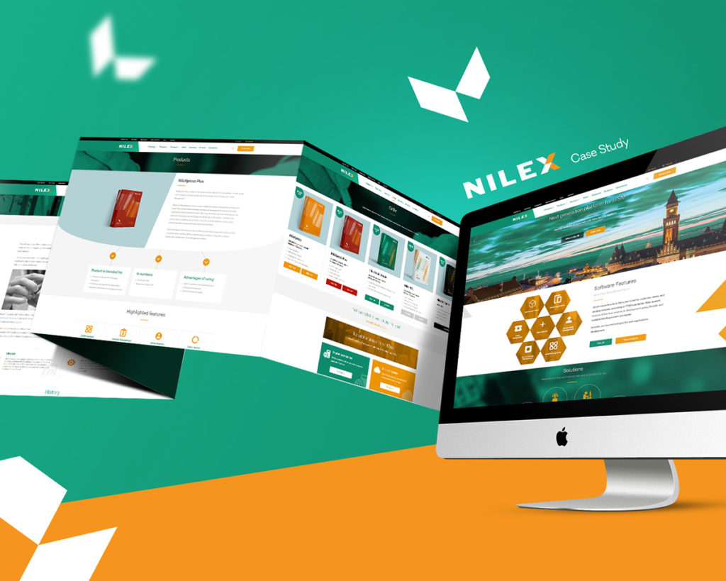
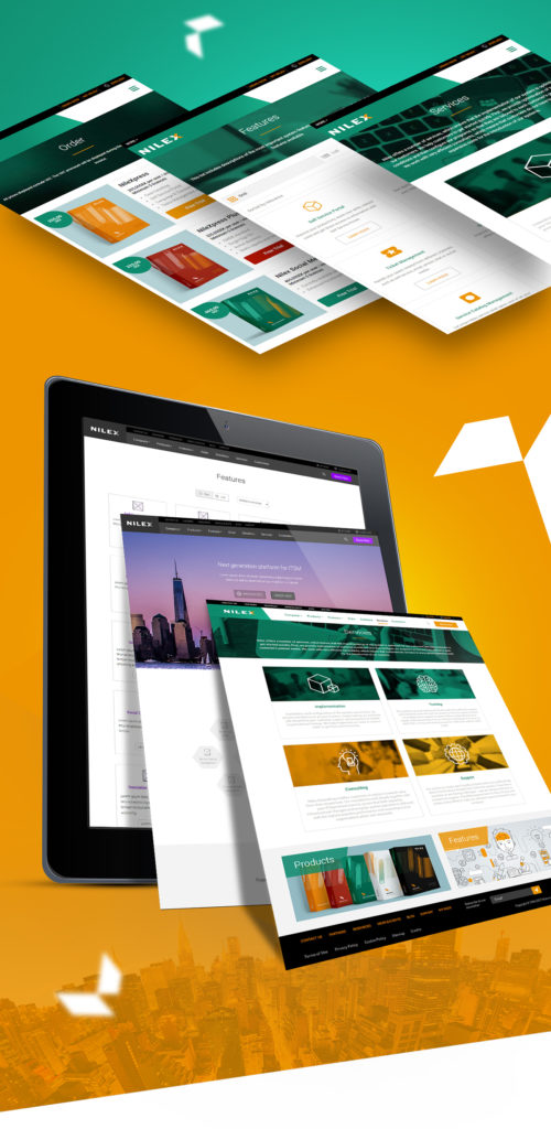
Nilex Website
Ready
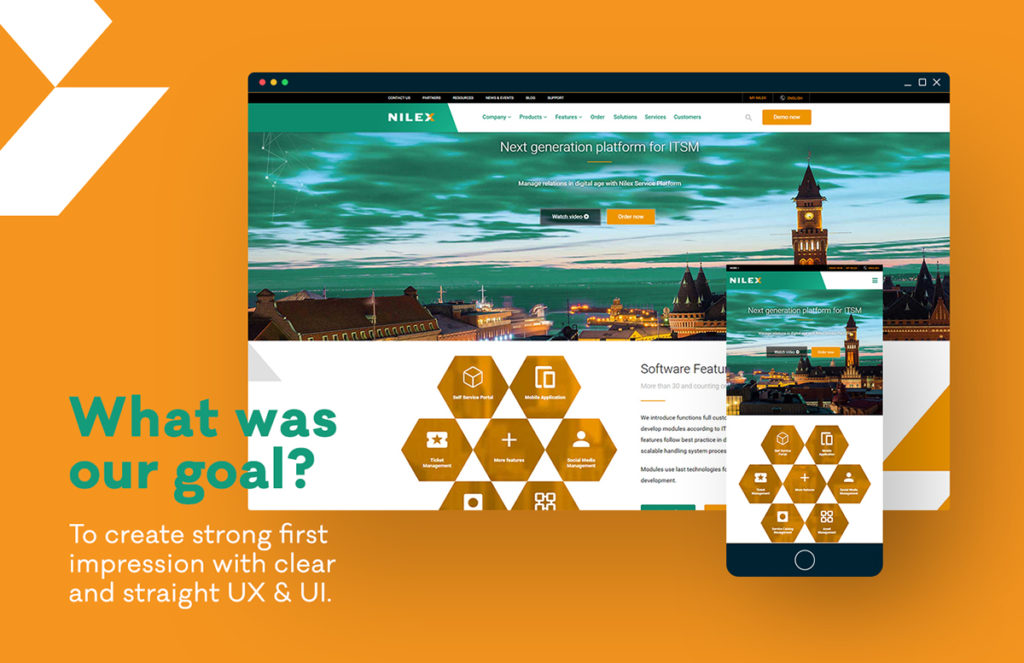
The first stage was to come up with completely outstanding and unique web experience. We had a tough task: to incorporate a visual solution which is both user friendly and product explanatory.
A challenge?
Statistics – the first thing our UX team started from. Research, research, more research and then research analysis.
Extensive research led us to conceive the concept which we then ambitiously embraced. With the help of Hotjar, we identified the most relevant information and got the impression of the most viewed content on the website, for which we knew it had to be the highlight of the online presentation. During this phase, we defined our target audience.
We tested solution first and then designed every piece of an overall experience.
And Go
UX design and information architecture
The need for substantial improvement, unification, and a complete redesign in order to achieve an optimal user-friendly experience.
We used paper prototyping technique for the more complex pages. To put it simply, this method involves creating rough drawings of an interface which are used as a base for brainstorming and quick evaluation of multiple versions of complex pages. Information architecture has been changed and improved several times during high fidelity prototyping phase.
Prototyping was pure enjoyment with a Justinmind tool which enables the creation of fully interactive low to high fidelity prototyping.
Considering the site is rich in different types of pages, the imperative was to create an intuitive navigation system to smoothly guide users through the entire website.
UX team provided users with the opportunity to feel as free as they can be while exploring the whole sitemap. What we had in mind is a large group of users that will land on the website for the first time, so we made ourselves a task: to add additional impulse that will inspire people to engage, explore and search further through the benefits of this software.
So, the next chapter was to visually enhance the UX prototype and plan advanced interactions through UI design phase.
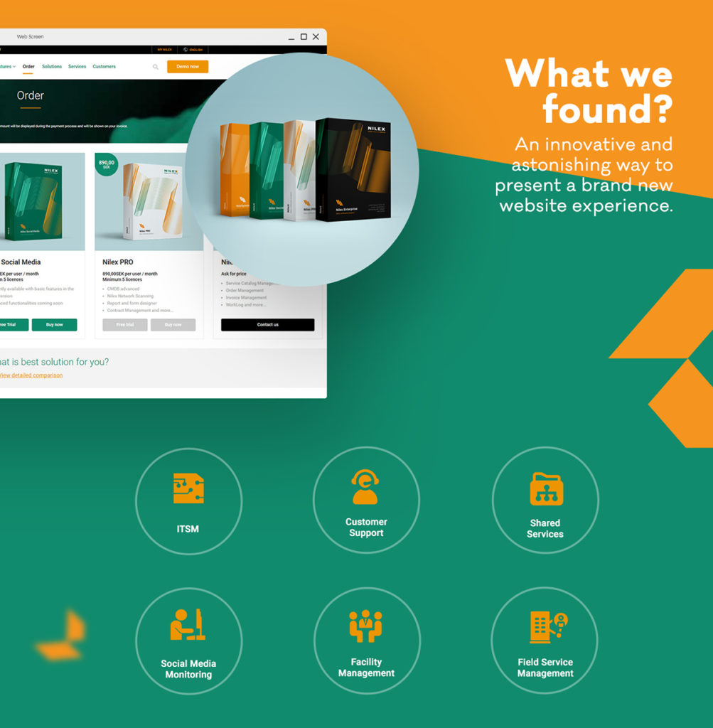
UI design – Our UI team had an assignment to redesign the overall framework. So, we put it this way: innovative, interactive and essential. We imagined a visually superior website. All the elements were carefully selected to incite an extraordinary experience and interaction.
We practically remade the old website, creating totally fluid interactive environment for all users. Result: Creative minds of our designers came up with a simple layout.
Before setting out a full content, to tease our target audience, we decided to focus on a presentation video on a customer based explanation of a software, and put it in the foreground on home page. The video which was followed by brilliant user reactions, who said that we managed to explain all the features of the software in just a minute and a half, was the perfect starting point for users who wanted to learn more about the Nilex software.
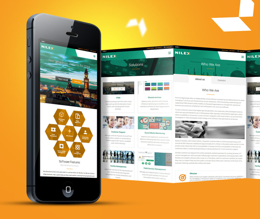
Mobile version – To develop a site you can scroll through with the top of your thumb? This was the special treat for our team. The full experience fits into 4-5 inch screens. Something in step with the time, which had only one, but crucial purpose: to communicate professionalism and simplicity.
Although the change of existing paradigms took a lot of time, the team was so eager to readapt this part. Site building from the ground to the top, combined with the redefinition of navigation that will satisfy the user on every platform.
If you wonder what the secret is, the answer is: persistence,
persistence, and in the end, some more persistence. :)
Results
The site saw the light of a day and shines in all its glory.
Built-in Google and Hotjar analytics codes, it provides access to a detail information on how users see the whole thing packed together.
Based on analysis of visits and results, we are working on redesign and adaptation to the users’ needs, since we are guided by User-centered design.
We let this unique visual solution speak for itself.
And that’s not all
To give you a hint what you can do with this software, check out the short presentation video we made for the occasion of new version release.