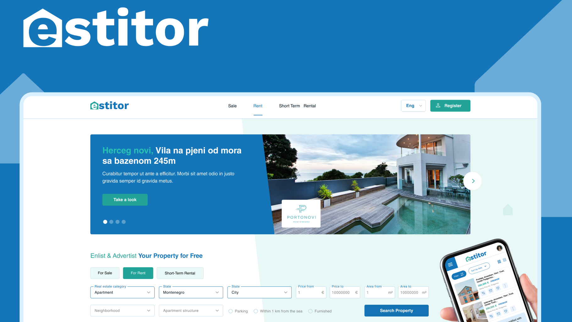
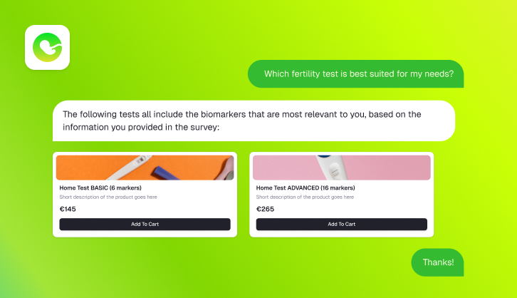
Štrafta gastro bar

When creating a logo, we aim to make it unique, simple, appealing and easy to remember.
Logo for “Štrafta” gastro bar, which means “stripe”, is a combination of rustic and modern, wood and metal, recalling an urban place with a soul and warmth of a hearty welcome. Guided by the energy of “Štrafta”, logo is dynamic and energized, but at the same time geometrically regular and balanced. This is a handheld logo design, which makes it unique and inimitable. Moves are sharp, giving the effect of rawness, yet the line has the same thickness along the entire move which gives it a modern look. A stripe, as an integral part of the logo, serves as a decoration but also can be used as a graphic element independently.

photo: Aleksandar Lex Jaredić

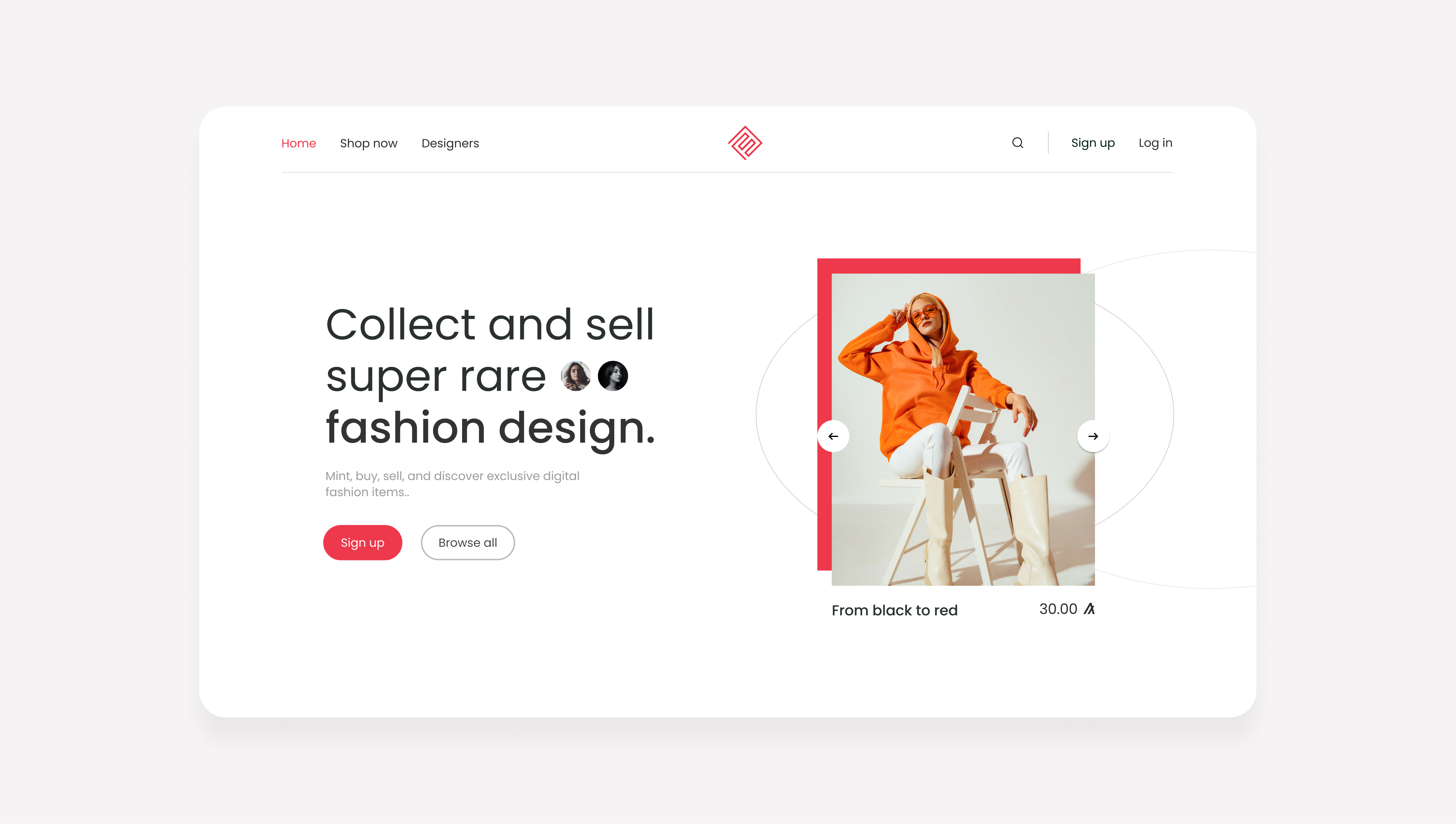
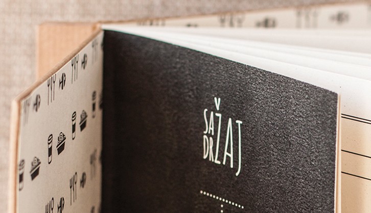
Menu needs to be in line with overall corporate identity and brand standards, therefore its design can be described as playful, urban and freed from rules, standing out with surreal vintage illustrations where each object is put in an unexpected and different role from its original use.

Branding and design: Bild Studio
Interior design: A4 studio
Like what you see?
Let's talk